SELLING BIO
During my year of volunteering I worked in a shop which sells organic products from local producers in more delivery points. I had the opportunity to analyse data from the previous years.
Cleaning the dataset
I analysed the data between 2018-01-01 and 2023-09-30 and I only considered the selling points, which are still working. In my first dataset I had the name of the customer, the selling point and the day and the value of a given order. Setting up a boxplot for the value of the selling, we see that the data is highly right skewed. To have a clearer understanding of the typical buyings I excluded the orders with a value above 350 and also the ones with a value less than 1 euro.
CODE
#lodaig and observing the data
vendita <- read_excel("C:/Users/User/Downloads/Suli/4.félév/Öko/öko/aiabdatabase.xlsx")
str(vendita)
#cleaning the dataset
cleand <- vendita %>%
filter(listino %in%
c("Amelia",
"Consegna a Domicilio",
"Negozio",
"Ritiro al negozio",
"Terni",
"Todi",
"Ponte Solidale - Ponte San Giovanni")) %>%
mutate(month_r = format(as.Date(tempo), "%Y-%m")) %>%
select(nome, listino, tempo, month_r, totale_s)
cleand$month_r <- as.Date(paste0(as.character(cleand$month_r), '-01'), format ="%Y-%m-%d")
head(cleand)
write_xlsx(cleand,"C:\\Users\\User\\Downloads\\aiabexcel\\cleand.xlsx")
#Descriptive stat
windowsFonts(A = windowsFont("Times New Roman"))
before_clean_boxplot <- ggplot(vendita, aes(totale_s)) +
geom_boxplot(fill="cadetblue2") +
theme(axis.title.x = element_blank())
#there is an outlier, which I delete
cleand <- cleand %>%
filter(totale_s < 350)
#there also too small values
cleand %>%
filter(totale_s < 1)
nrow()
cleand <- cleand %>%
filter(totale_s > 1)
after_clean_boxplot <- ggplot(cleand, aes(totale_s)) +
geom_boxplot(fill="cadetblue2") +
labs(x = "Value of the orders")
grid.arrange(before_clean_boxplot,
after_clean_boxplot,
top = "Distribution of the orders by values before and after including outliers")

Typical order
Among the data included after the cleaning we can see from the histogram, that the typical shopping is between 1 and 100 euro. 95% of the orders fall into this range and 82% of the revenue comes from here. Closing the circle further, half of the customers spend between 10 and 40 euros on one order, which gives one third of the revenue.
CODE
#Cheking the average ordering habits
#spending on one order
ggplot(cleand, aes(totale_s)) +
geom_histogram(binwidth = 10, fill="cadetblue2", color = "darkblue") +
geom_vline(aes(xintercept = mean(totale_s)),
size = 1,
linetype = "dashed") +
ggtitle("Number of orders by amount of money spent") +
labs(x = "Value of the orders",
y = "Number of orders")
(nrow(filter(cleand, totale_s < 100)) / nrow(cleand)) * 100
typ <- cleand %>% filter(totale_s < 100)
(sum(typ$totale_s)/ sum(cleand$totale_s)) * 100
(nrow(filter(cleand, totale_s < 40 & totale_s > 10 )) / nrow(cleand)) * 100
mosttyp <- cleand %>% filter(totale_s < 40 & totale_s > 10)
(sum(mosttyp$totale_s)/ sum(cleand$totale_s)) * 100
#monthly number of orders per member
reacurring <- cleand %>%
group_by(nome, month_r) %>%
summarise(nm_orders = n_distinct(tempo))
#exclude customers belongig to aiab
reacurring <- filter(reacurring, !nome %in% c("name1",
"name2",
"name3",
"name4",
"name5",
"name6"))
write_xlsx(reacurring,"C:\\Users\\User\\Downloads\\aiabexcel\\reacurring.xlsx")
(nrow(filter(reacurring, nm_orders == 1)) / nrow(reacurring)) * 100
mean(reacurring$nm_orders)
median(reacurring$nm_orders)
ggplot(filter(reacurring, nm_orders < 10), aes(nm_orders)) +
geom_bar(fill = "darkblue", size = 2) +
ggtitle("Distribution of monthly number of orders per member") +
labs(x = "Number of orders made in a month",
y = "Customers with the given number of orders") +
scale_x_continuous(breaks = c(1,2,3,4,5,6,7,8,9,10))
reacurring_avg <- reacurring %>%
group_by(month_r) %>%
summarise(mean = mean(nm_orders))
max(reacurring_avg$mean)
min(reacurring_avg$mean)
ggplot(reacurring_avg, aes(month_r, mean)) +
geom_line() +
geom_point(color = format(as.Date(reacurring_avg$month_r, format="%Y-%m-%d"),"%m")) +
geom_smooth() +
ggtitle("Monthly number of orders per member on average") +
theme(axis.title.x = element_blank(),
axis.title.y = element_blank())

Most of the customers (42%) only make one order per month. The average monthly number of orders per member is 2,27 and the median is 2.
This data shows no trend if we check it since 2018, in 2023 it moved between 2.02 and 2.63.
(This part was counted with the exclusion of customers with unusually high number of orders, because they work/worked at the shop so they do not represent the typical customer. Names were changed in the code to name1-name6 to keep privacy.)


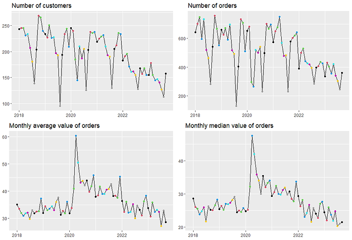
Change in revenue
In 2020 and 2021 the revenue of the shop could still grow but 2022 brought a big decline. For 2023 I didn’t count the change, as the year hasn’t ended yet, but if we ad the last three months data from 2022, still we would forecast a decline.

The monthly revenue has a strongly declining trend since 2021.
Every year August is the month with the least revenue thanks to the summer break around Ferragosto but since this got shorter (18-19: 2 weeks, 20-21: 1.5 week, 22-23: 1 week) the difference started to be smaller.
If we take a look at the monthly change of the number of the customers and orders, the mean and the median we can say that the previous two could reason the decline in revenue more.
CODE
#setting up the monthly data
nm_orders <- cleand %>%
count(month_r) %>%
rename(nm_orders = n)
monthly <- cleand %>%
group_by(month_r) %>%
summarise(monthly_mean = mean(totale_s),
monthly_median = median(totale_s),
monthly_sum = sum(totale_s),
nm_customers = n_distinct(nome)) %>%
left_join(nm_orders, by = "month_r")
write_xlsx(monthly,"C:\\Users\\User\\Downloads\\aiabexcel\\monthly.xlsx")
#setting up the yearly data
yearly <- cleand %>%
mutate(year = format(as.Date(month_r, format="%Y-%m-%d"),"%Y")) %>%
group_by(year) %>%
summarise(yearly_sum = sum(totale_s))
yearly <- yearly %>%
mutate(change = ((yearly_sum / lag(yearly_sum) - 1) * 100))
write_xlsx(yearly,"C:\\Users\\User\\Downloads\\aiabexcel\\yearly.xlsx")
ggplot(monthly, aes(month_r, monthly_sum)) +
geom_line() +
geom_point(color = format(as.Date(monthly$month_r, format="%Y-%m-%d"),"%m")) +
geom_smooth() +
ggtitle("Monthly revenue") +
theme(axis.title.x = element_blank(),
axis.title.y = element_blank())
change_nmcust <- ggplot(monthly, aes(month_r, nm_customers)) +
geom_line() +
geom_point(color = format(as.Date(monthly$month_r, format="%Y-%m-%d"),"%m")) +
geom_smooth() +
ggtitle("Number of customers") +
theme(axis.title.x = element_blank(),
axis.title.y = element_blank())
change_nmord <- ggplot(monthly, aes(month_r, nm_orders)) +
geom_line() +
geom_point(color = format(as.Date(monthly$month_r, format="%Y-%m-%d"),"%m")) +
geom_smooth() +
ggtitle("Number of orders") +
theme(axis.title.x = element_blank(),
axis.title.y = element_blank())
change_mean <- ggplot(monthly, aes(month_r, monthly_mean)) +
geom_line() +
geom_point(color = format(as.Date(monthly$month_r, format="%Y-%m-%d"),"%m")) +
geom_smooth() +
ggtitle("Monthly average value of orders") +
theme(axis.title.x = element_blank(),
axis.title.y = element_blank())
change_median <- ggplot(monthly, aes(month_r, monthly_median)) +
geom_line() +
geom_point(color = format(as.Date(monthly$month_r, format="%Y-%m-%d"),"%m")) +
geom_smooth() +
ggtitle("Monthly median value of orders") +
theme(axis.title.x = element_blank(),
axis.title.y = element_blank())
grid.arrange(change_nmcust, change_nmord, change_mean, change_median)

Distributing centres
The members of AIAB Umbria can pick up their orders in different locations with a diverse regularity.
To look for differences between the charts, I checked their monthly income. Because of the big difference, I divided the charts into three groups:
-
Collection gives the highest revenue between 2700 and 19500
-
Home Delivery and Shop were mostly between 2000 and 8000
-
Ponte, Terni , Amelia and Todi were always under 2500
CODE
#changeing the dataset to see the difference between the distributing centers
nm_orders_periferici <- cleand %>%
group_by(listino) %>%
count(month_r) %>%
rename(nm_orders = n)
monthly_periferici <- cleand %>%
group_by(month_r, listino) %>%
summarise(monthly_mean = mean(totale_s),
monthly_median = median(totale_s),
monthly_sum = sum(totale_s),
nm_customers = n_distinct(nome)) %>%
left_join(nm_orders_periferici, by = c("month_r", "listino"))
write_xlsx(monthly_periferici,"C:\\Users\\User\\Downloads\\aiabexcel\\monthly_periferici.xlsx")
#checking monthly sum, average and median for different periferici
ggplot(filter(monthly_periferici, listino == "Ritiro al negozio"),
aes(month_r, monthly_sum)) +
geom_line() +
facet_wrap(~ listino) +
ggtitle("Monthly revenue") +
theme(axis.title.x = element_blank(),
axis.title.y = element_blank())
ggplot(filter(monthly_periferici, listino %in% c("Consegna a Domicilio",
"Negozio")),
aes(month_r, monthly_sum)) +
geom_line() +
facet_wrap(~ listino) +
ggtitle("Monthly revenue") +
theme(axis.title.x = element_blank(),
axis.title.y = element_blank())
ggplot(filter(monthly_periferici, listino %in% c("Terni",
"Todi",
"Ponte Solidale - Ponte San Giovanni",
"Amelia")),
aes(month_r, monthly_sum)) +
geom_line() +
facet_wrap(~ listino) +
ggtitle("Monthly revenue") +
theme(axis.title.x = element_blank(),
axis.title.y = element_blank())
ggplot(monthly_periferici, aes(month_r, monthly_mean)) +
geom_line() +
facet_wrap(~ listino) +
ggtitle("Monthly average value of orders") +
theme(axis.title.x = element_blank(),
axis.title.y = element_blank())
#cheking without Todi
ggplot(data = filter(monthly_periferici,
listino %in% c("Terni",
"Amelia",
"Ponte Solidale - Ponte San Giovanni",
"Consegna a Domicilio",
"Negozio",
"Ritiro al negozio")),
aes(month_r, monthly_mean)) +
geom_line() +
facet_wrap(~ listino) +
ggtitle("Monthly average value of orders") +
theme(axis.title.x = element_blank(),
axis.title.y = element_blank())
#checking data by year
yearly_periferici <- monthly_periferici %>%
group_by(year = format(as.Date(monthly_periferici$month_r, format="%Y-%m-%d"),"%Y"),
listino) %>%
summarise(pmsum = sum(monthly_sum))
write_xlsx(yearly_periferici,"C:\\Users\\User\\Downloads\\aiabexcel\\yearly_periferici.xlsx")
ggplot(yearly_periferici,
aes(year, pmsum, fill = listino)) +
geom_col() +
ggtitle("Total yearly revenue by listino") +
labs(y = "revenue") +
theme(axis.title.x = element_blank())


We can see that the biggest decline was in Ritirio al negozio, where the revenue from 2021 to 2022 fall to less than the half. This is especially important because the revenue coming from this location is gives a much bigger part of the total revenue. While in 2018 almost three quarter of the revenue was from Ritiro in 2022 and in 2023 only one third came from here.
In 2023 the second and the third most important places are the Negozio (23,4%) and the Domicilio (16,1%).

Considering the average value of one order in the different locations, Todi’s orders are usually the ones with the highest value, in the las year mostly between 75-100€. The next biggest orders are in Domicilio typically between 50-75€. The orders of Amelia are around 50€ and in Ponte, Ritirio and Terni usually 25-50€ is spent on an order. The cheapest average orders are in Negozio, where the average spending in an order is less than 25€ in most of the months. On the other hand, the amount spent on an order doesn’t vary more than 50€ in most of the listinos so as earlier stated the problem lies more on the number of the orders.

Products
For getting more information about the products sold, I downloaded quarterly data from 2020 Q1. Setting up the dataset contained a lot of renaming to make the categories of products more clear but as they are the same codingwise I only show the code for setting up the first category in the next block.
CODE
#clean the dataset
products <- read_excel("C:/Users/User/Downloads/Suli/4.félév/Öko/öko/aiabdatabase.xlsx", sheet = 2) %>%
rename(prodotto = Prodotto,
categoria = Categoria,
fornitore = Fornitore,
quantita = Quantita,
totale = Totale) %>%
separate(quantita, into = c("quantita", "unita"), sep = " ") %>%
mutate(time2 = time, categoria_detailed = categoria) %>%
separate(time2, into = c("year", "quarter"), sep = " ")
products$time <- as.yearqtr(products$time, format = "%Y Q%q")
products$quantita <- as.numeric(products$quantita)
products$totale <- as.numeric(products$totale)
#after the first presentation we decided to make a correction in the name of the vegetables and fruits, because the same product was
#in some cases with more names so I made a table with the old and the new names and I joined it to the original table
products_new <- read_excel("C:/Users/User/Downloads/Suli/4.félév/Öko/öko/Book1.xlsx") %>%
group_by(prodotto, prodotto2) %>%
count()
products <- products %>%
left_join(products_new, by = "prodotto")
#making bigger categories
#Alcol: Vino Rosso, Vino Rosso, Vino Rosso, Birra, Bollicine, Passiti e Grappe
products$categoria <- str_replace_all(products$categoria, "Vino Rosso", "Alcol")
products$categoria <- str_replace_all(products$categoria, "Vino Bianco", "Alcol")
products$categoria <- str_replace_all(products$categoria, "Vino Rosato", "Alcol")
products$categoria <- str_replace_all(products$categoria, "Birra", "Alcol")
products$categoria <- str_replace_all(products$categoria, "Bollicine", "Alcol")
products$categoria <- str_replace_all(products$categoria, "Passiti e Grappe", "Alcol")
write_xlsx(products,"C:\\Users\\User\\Downloads\\aiabexcel\\products.xlsx")
#number of products by year
diff_prods_by_year <- products %>%
group_by(prodotto, year) %>%
summarise(revenue = sum(totale))
ggplot(diff_prods_by_year, aes(year)) +
geom_bar(fill = "darkblue") +
ggtitle("Number of different products sold in each year") +
theme(axis.title.x = element_blank(),
axis.title.y = element_blank())
nrow(filter(diff_prods_by_year, year == 2023)) / nrow(filter(diff_prods_by_year, year == 2022))
#number of products by quarter
diff_prods_by_quarter <- products %>%
group_by(prodotto, time) %>%
summarise(revenue = sum(totale)) %>%
mutate(time2 = time) %>%
separate(time2, into = c("year", "quarter"), sep = " ")
ggplot(diff_prods_by_quarter, aes(time, fill = quarter)) +
geom_bar() +
ggtitle("Number of different products sold in each quarter") +
theme(axis.title.x = element_blank(),
axis.title.y = element_blank())

First, I checked how many different products we sold in each year. We can see that the variety of products was the least in 2023. From 2022 to 2023 the number of different products decreased by 19%.
As 2023 is not ended yet it worth to see the quarterly data as well, where we can see that usually the last quarter has the most product type, so we can assume that the difference between 2022 and 2023 will be smaller by the end of the year.

To see in which category we have bigger and smaller variety I made a new table with the wider category groups and checked the number of different products sold in them in 2023.
This year among others we sold 33 kind of fruit and 105 kind of vegetables.
CODE
#number of products in each category in 2023
num_categorie_2023 <- products %>%
count(categoria, year, sort = T) %>%
filter(year == "2023",
categoria != "Spesa Sospesa")
write_xlsx(num_categorie_2023,"C:\\Users\\User\\Downloads\\aiabexcel\\num_categorie_2023.xlsx")
ggplot(num_categorie_2023, aes(x = fct_reorder(categoria, n), n)) +
geom_col(fill = "darkblue") +
ggtitle("Number of different products by category in 2023") +
theme(axis.title.x = element_blank(),
axis.title.y = element_blank())
#revenue in each category in 2023
rev_categorie_yearly <- products %>%
group_by(categoria, year) %>%
summarise(revenue = sum(totale)) %>%
filter(categoria != "Spesa Sospesa")
ggplot(filter(rev_categorie_yearly, year == "2023"),
aes(x = fct_reorder(categoria, revenue), revenue)) +
geom_col(fill = "darkblue") +
ggtitle("Revenue by product category in 2023") +
theme(axis.title.x = element_blank(),
axis.title.y = element_blank())
ggplot(rev_categorie_yearly, aes(year, revenue, fill = categoria)) +
geom_col(color = "darkblue") +
ggtitle("Revenue in product categories") +
theme(axis.title.x = element_blank(),
axis.title.y = element_blank())

Next to the variety of each group it is also important to see how many revenue they produce.
Surprisingly the biggest revenue was not from the vegetables or the fruits which are in the main focus of the shop but the dairy products. The explanation of this is that these products have a much bigger per kg price, so even if less quantity is sold from them, they can easily reach a higher revenue.

If we take a look at the change, we see that the there wasn’t a big change in the proportions, rather every product declined in a similar rate.
The revenue from the vegetables was over 50.000 both in 2020 and 2021 but in 2022 it sank to 35.156 (-33% comperd to the previous year).
From the fruits came 12%, from the dairy products 30% less money in 2022 than in 2021.

Bestselling products
CODE
#top products
Verdura <- products %>%
filter(categoria == "Verdura",
year == "2023") %>%
group_by(prodotto) %>%
summarise(count = sum(quantita),
revenue = sum(totale))
Frutta <- products %>%
filter(categoria == "Frutta") %>%
group_by(prodotto) %>%
summarise(count = sum(quantita),
revenue = sum(totale))
Latticini_uova <- products %>%
filter(categoria == "Latticini, uova") %>%
group_by(prodotto) %>%
summarise(count = sum(quantita),
revenue = sum(totale))
Best sellers in 2023 by quantity (only products in Kg considered, until the end of September)
Vegetables
-
Patate gialle 833 Kg
-
Pomodori da sugo 734 Kg
-
Carote 509 kg
-
Pomodoro 357 Kg
-
Zucchine verde 355 Kg
-
Insalata canasta 263 Kg
-
Bieta verde 232 kg
-
Cetrioli 224 Kg
-
Cicoria 203 Kg
-
Cavolfiore 194 Kg
Fruits
-
Mele 1688 Kg
-
Banane 783 Kg
-
Arance da tavola 710 Kg
-
Arance da spermuta 382 Kg
-
Limoni 306 Kg
-
Clementine 218 Kg
-
Melone retato 181 Kg
-
Pesche percoche 181 Kg
-
Albicocche 179 Kg
-
Anguria 169 Kg
Dairy products
-
Parmigiano 24 mesi 106 Kg
-
Parmigiano 30 mesi 93 Kg
-
Parmigiano 12 mesi 91 Kg
-
Ricotta di Pecora 37 Kg
-
Formaggio di capra 26 Kg
-
Scamorza 25 Kg
-
Capra primo sale 24 Kg
-
Capra stagionato 20 Kg
-
Caciotta di Vacca 18 Kg
-
Ravigiolo (formaggio morbido) 18 Kg
Products with the highest revenue in 2023
Vegetables
-
Patate gialle 1698€
-
Carote 1201€
-
Pomodori da sugo 1005€
-
Pomodoro 882€
-
Insalata canasta 874€
-
Zucchine 844€
-
Cicoria 594€
-
Cipolotto fresco 584€
-
Cetrioli 568€
-
Aglio 543€
Fruits
-
Mele 4363€
-
Banane 2456€
-
Arance da tavola 1626€
-
Limoni 988€
-
Pesche percoche 615€
-
Clementine 505€
-
Melone retato 482€
-
Kiwi 468€
-
Fragole 453€
-
Susine 314€
Dairy products
-
Parmigiano 24 mesi 2288€
-
Parmigiano 30 mesi 2149€
-
Uova sfuse 2014€
-
Parmigiano 12 mesi 1741€
-
Yogurt bianco 1547€
-
Latte parzialmente 1446€
-
Uova confezionate Liberovo 1249€
-
Latte intero UHT 998€
-
Formaggio di capra 721€
-
Mozzarelle 521€